Web Dashboards
With BrowseReporter’s web dashboards, you can keep a pulse of your workforce productivity and computer usage all in one place.
Dashboards:
- Overview
- Productivity
- Websites
- Application
- Bandwidth
- Groups
- Users
Overview
- Productivity Scorecards
- Top Website and Application Activities
- Top Active and Idle Users
Productivity
- Productivity
- Top 5 productive by groups/users
- Top 5 unproductive by groups/users
- Top 5 categories by productivity
- Top 5 websites by productivity
- Productivity Activity Log
Websites
- Website Activity
- Top 5 websites by groups/users
- Top 5 groups/users by active time
- Websites Activity Summary
- Websites Activity Detailed
- Browsing Date & Time
- User
- Group
- Domain
- Active Time
- URL (optional column)
- Webpage Title (optional column)
- Block Status (optional column)
- Categories (optional column)
- Idle Time (optional column)
Applications
- Application Activity
- Top 5 Applications by groups/users
- Top 5 Groups/Users by Active Time
- Application Activity Summary
- Application Activity Detailed
- Date & Hour
- User
- Group
- Application
- Active Time
- Application Process (optional column)
- Idle Time (optional column)
Bandwidth
- Bandwidth Traffic
- Top 5 Groups/Users by Downloads & Uploads
Groups Dashboard
- Top 5 Productive Users
- Top 5 Unproductive Users
- Activity Log – Productivity
- Activity Log – Websites
- Activity Log – Applications
- Activity Log – Bandwidth
Users Dashboard
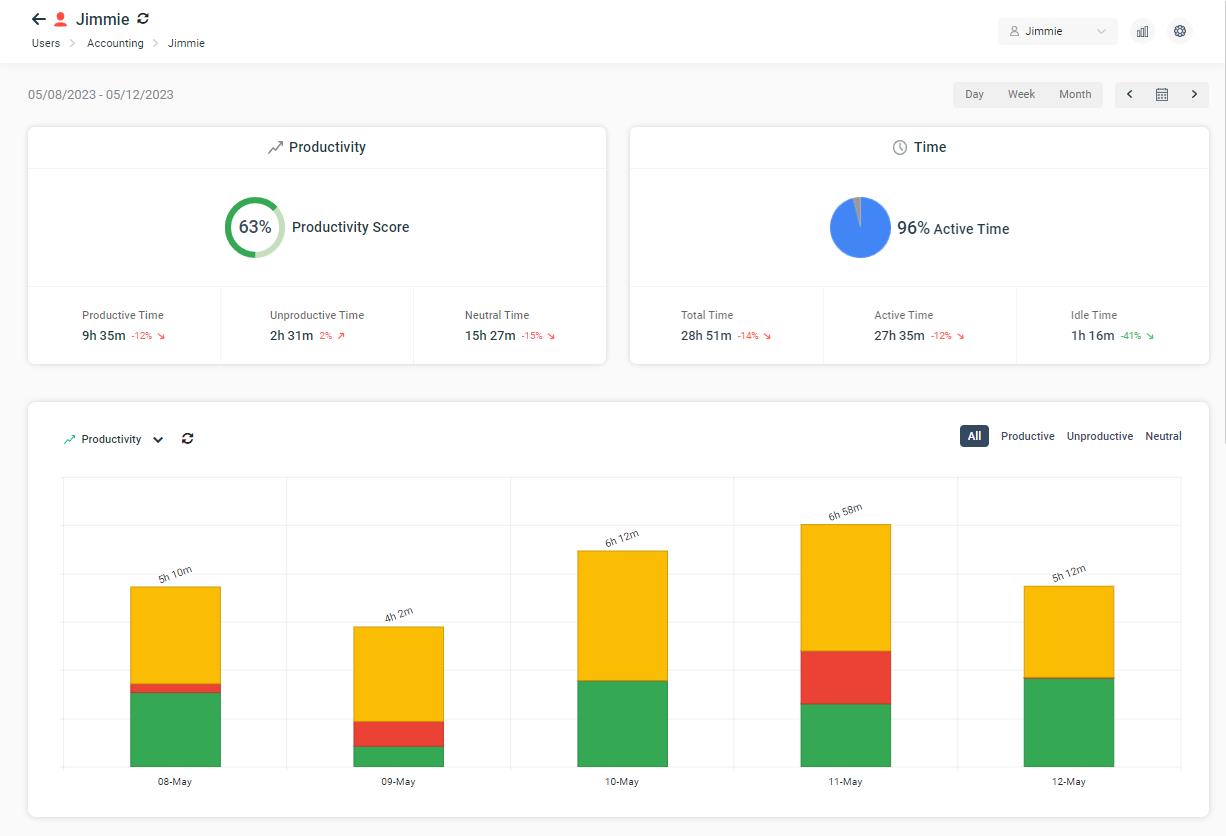
- Productivity Score & Productivity Metrics
- Active & Idle Time Metrics
- Charts
- Productivity Chart
- Active & Idle Time Chart
- Application Activity Chart
- Website Activity Chart
- Bandwidth Traffic Chart
- Activity Log – Summary (group activities by time)
- Activity Log – Detailed (minute-by-minute coverage)
Using the Dashboard
On each dashboard page, you have the option to change the selection based on the groups/users that you want to display. You can also change the date range using the date picker.
Groups/Users Selections
Choose
all groups to see reports on your entire organization. Filter down to
specific groups and users to gauge how your departments are performing.
The charts on the dashboards will change depending on your selection. For example, if you select groups, the Top 5 Active Time charts under the Overview will display the top 5 groups. Whereas, when you select all users, that chart will display your top 5 users.
Date Picker
Change
the date to compare how your organization is performing based on your
date range. Presets buttons are available for quick access to common
date ranges such as today, this week and last 30 days.
Productivity scorecards automatically compare the date you picked with the previous date range.
Date range is limited to 6 months. Learn more about it in this article.
Analyzing data using the Activity Log
Each dashboard contains an activity log at the bottom of the page to give you detailed information on your organization’s activities.
- Sorting: every column is sorted. Click on the header to sort the data.
- Search: use this to narrow down the results. This is especially useful in detailed tables where you want to search for activities on specific websites or applications.
- Optional Columns: some tables contain optional columns that are hidden by default. Click on the 3 dots to reveal these optional columns.
- Export to PDF/Excel: to take your data further, you can export them in .PDF or .xlsx format to perform your own data analysis.
Dashboard Settings Menu
Located on the top right hand corner of the page, there is a gear icon (settings) that lets you configure BrowseReporter’s core features.
- Productivity Grading: change the category/website grading for your productivity scores
- More Reports: a shortcut that takes you to the legacy report window
- Exclusion List: a shortcut that takes you to the setting to exclude websites/applications from your dashboards
- Delete Data: a shortcut that takes you to the data deletion tool
- Tracking Options: a shortcut that takes you to BrowseReporter tracking options where you can enable/disable tracking, change your idle time, location track and upload frequency.
Related Articles
Web Dashboards
AccessPatrol has 7 dashboards, giving you visibilities on file operations and device activities from your entire organization. With AccessPatrol’s web dashboard, you will gain the insights you need to enforce your removable media policy with great ...Custom Dashboards
Custom dashboard allows users to create new dashboards using existing widgets. With over 20 available widgets, users can choose the ones that will help them understand employee productivity, time spent on websites/apps, USB file transfer history, ...Web Dashboard 12 Months Date Range
The CurrentWare BrowseReporter and AccessPatrol web dashboards are designed to provide a comprehensive and efficient way to monitor web activity and access control. To ensure a smooth user experience, the dashboards have been configured to allow the ...Troubleshoot Web Console Issues
If you are having issues with your Web Console, this page will give you a rundown of the various troubleshooting steps that can help solve your individual issue. Sections Login Issues Unable to create/delete/rename or change from PC to User mode I ...Web Console Login Issues
When the CurrentWare Web Console is not configured properly, you will encounter the error message "Error connecting to the server." Here are some recommendations for fixing your login issues. 1. Clear your Browser Cache 2. Fix your Web Console ...